Introduction
Part of the SDR reporting side, cpuplayer is a simple and intuitive tool designed after Prof. Neil Gunther, Barry3 Mathematica simulation. The way people listen to music and watch movies, using their preferate mp3 or divx player, similar system administrators and performance analysts watch system performance data, but using visual tools. cpuplayer tries to be the tool for this job.
Design
Problem solving is a very important skill for any System Administrator, Performance Analyst or even for a System Manager. Sometimes, you try to solve a problem by building a visual model of that problem and trying to see it. But can geometry in general help in understanding how some workload is executed on a 72CPU server ? It seems it can.
Welcome Problem solving and Computer Graphics, a land where geometry meets performance analysis, troubleshooting, problem solving or even capacity planning. Using the power of geometric figures we can build a model of our original problem, we can simulate the conditions and we can see the results letting the computer to do all the work for us in a graphical representation - easy to be digested by us. cpuplayer is such tool, which combines problem solving, geometry, performance analysis in one thing. Using Barycentric coordinates, the player displays the CPU transition states from IDLE to USER or SYSTEM time.
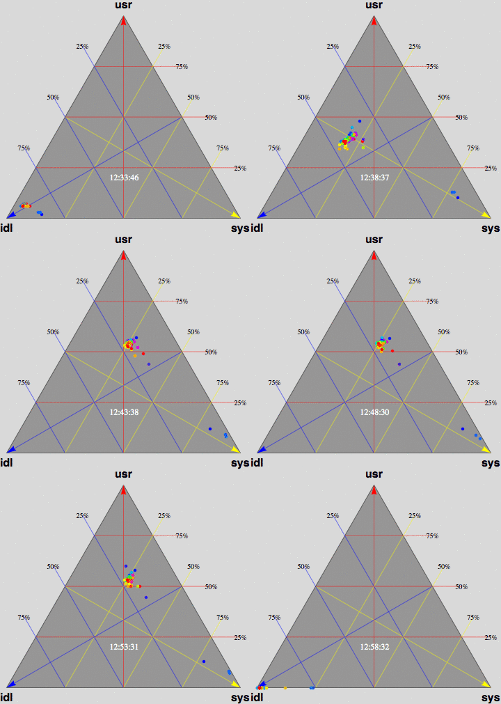
This animation shows CPU utilization for a 72-way E15K multiprocessor as it ramps up to steady state and executes a network-based transaction workload on ORACLE DB 10g.

The 3-triangular axes are defined as follows:
- percent user time (north-pointing red arrow). Apex USR.
- percent system time (southeast-pointing yellow arrow). Vertex SYS.
- percent idle time (southwest-pointing blue arrow). Vertex IDL.
This triangle is affectionately known as "Barry3" because it corresponds to a BARYCENTRIC coordinate system---not usually seen in performance analysis, and it displays 3 barycentric coordinates: %user, %sys, and %idle times.
Each of the 72 CPUs is represented by a colored dot inside the triangular area. The animation shows the time development of processor utilization. The actual wall-clock time is shown as an odometer display in the lower third of the triangle. The frame rate of 1 second in this animation corresponds to 10 seconds of real time, as shown in the clock display. Data was supplied with permission by Tim Cook of Sun Microsystems.
At 12:36:46, all CPUS are essentially idle and therefore are located in the southwest corner at the IDL vertex; corresponding to maximum idleness. As time progresses, the CPUs begin to make their way (northeast) along the blue idle axis. Since their motion is opposite to the direction of the blue arrow, this indicates DECREASING idleness. Most CPUs eventually cluster around the region bounded by the blue 25% IDL line, the yellow 25% SYS line and the red 50% USR line. However, you'll soon notice that 3 CPUs peel off at around 10% USR time and rapidly migrate (eastward) to the 80-90% SYS location; near the tip of the yellow arrow. Why? It turns out that these CPUs are dedicated to handling network traffic, physical I/O, etc., in support of the Oracle transactions. At 12:53:41, the benchmark completes and all the CPUs rapidly return to the IDL corner. Some clean-up work continues as some CPUs are seen to run back and forth along the base of the Barry3 triangle between IDL and SYS time, i.e., zero USR time.
Credits
- OpenGL Programming Guide: The Official Guide to Learning OpenGL, Dave Shreiner
- Problem Solving and Computer Graphics, Steve Cunningham
- Barry3, Neil J. Gunther
- DigitAir Meteo Romania, Darius Popa
- Solaris Video Transcoding, Apostolos Syropoulos

